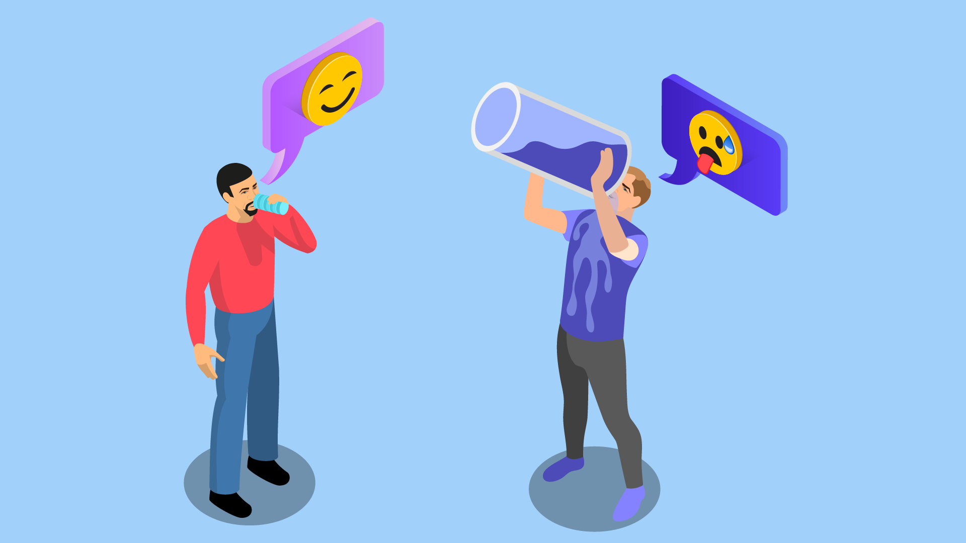
The Pepsi Challenge
In the 1970’s, the number two carbonated soda company (Pepsi) wanted a new approach to take market share from #1 Coca-Cola. They came up with the Pepsi Challenge, a blind taste test run in malls to pit the two drinks against each other. Their TV ads featured surprised consumers discovering they had picked Pepsi when they were lifelong Coke drinkers.
This proved that more people preferred Pepsi than Coke, right? Well.. no.
The test was performed using a small sample of soda - perhaps two good swallows. When presented to folks that hadn’t had much to drink recently (like in a Mall…) people tended to prefer the sweeter, more dramatic Pepsi taste. In short, it had a great Sip Test.
The turnaround came when folks were given the whole can - when the quantity increased, the preference swung the other way and more preferred Coke with a less sweet, more complicated flavor.1
The appeal of the Sip
I’ve been in many design meetings where the team keeps leaning towards sweet features - animations, lots of toast notifications to congratulate people on taking actions, images of people staring off into the middle distance… I’m betting you’ve been in the same meetings. These design elements appeal to our human love of being thanked and appreciated and can wow in a demo for a new product.
How will your users feel the 30th time they see a dialog enthusiastically pop up and tell them how proud you are that they completed a routine task? That warm language and cute animation will get old and your users will get frustrated with the time it takes to wait for it to display and then dismiss it so they can get on with their work.
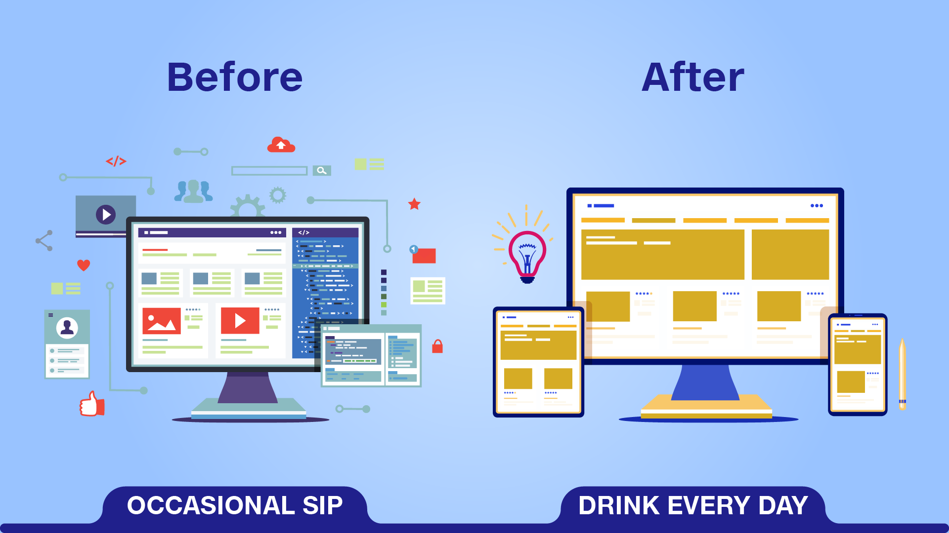
Design for the Drink
It takes fortitude for the design team to look beyond a great demo and instead focus on an experience that will improve with age. If you want your customers to rave about your product when they’ve been using it for tens or even hundreds of hours, it needs to feel like a natural extension of their thinking. Experienced users will even learn exactly what keystrokes it takes to get to each field, anticipate where they will be before they display, and have a visual scan to pick out the key data they need.
That tends towards:
- Minimal Exposition: Expository text that explains what’s going on should be kept short and have a notable visual change when its meaning changes so it falls into the background for experienced users until they need it.
- Large Data, Small Labels: Your user knows where the first and last name fields are, they’ve seen them a hundred times. Make the UI emphasize the data, not the label to locate the data.
- Non-modal Confirmation: When a user completes a task, show them a small confirmation and return them to their starting point (or another useful next step) instead of putting anything in their way. They trust your system and their actions.
There’s Room for Both
We’ve incorporated into our product design process asking the question - is this a sip or a drink feature? It’s clarified for us how to make design decisions on many tradeoffs:
| Problem | The Sip | The Drink |
|---|---|---|
| Execute multi-step Task | Wizards: Present the task step-by-step with plenty of explanation. | Tabbed Process: Focus on collecting the data with minimal explanations. |
| Create an Item | Textbox layout with each field laid out with explanations | Grid layout with top labels and a row per entity |
| Confirm Completion of a Task | Show a modal dialog congratulating the user on a job well done and telling them what happens next | Display a small confirmation note in the UI and return them to their starting point to get on the next task |
It’s not likely that your product is entirely Sip or Drink - even a line-of-business application used every day by users has some edge cases that are rarely run (like upgrades or monthly reports) that should be optimized for a sip experience.
Learn More
If you’d like to go deeper, check out these references:
- Design Guidelines for Complex Applications (Nielsen Normal Group) From the experts in UX research, this article walks through key tactics of UX for complex applications.
- Onboarding UX Patterns From Samuel Hulick, an outstanding onboarding analyst and designer, key onboarding moments and patterns you can adopt easily to address them.
-
Read Malcolm Gladwell’s book Blink: The Power of Thinking Without Thinking for more on this and other fascinating aspects of how we make decisions. ↩